ACL Music Festival
Mobile App Concept Redesign
BACKGROUND
ACL is a local music festival that takes place in Austin, TX at Zilker Park. It has grown to two weekends, eight stages and over 130 bands. While the event itself rocks (... & rolls, raps, sings) with personality, ambiance, & good vibes, the App itself is somewhat lacking.
CHALLENGE
Our team needed to fix the considerable disconnect between the festival vs. the App experience, as it currently does not match customer expectations. By empathizing with potential & existing ACL festival-goers, we can learn their needs when using the App. Focusing on habits, natural inclinations, essentials, & biggest turn-offs.
“The festival vs. the App experience doesn’t match customer expectations.”
Project Goals
1. Rewrite information architecture
2. Revamp Schedule to Allow For better visibility & capability to add Favorites
3. Develop the Profile section to include the ability to add Friends
4. Map drop-pins to facilitate group meetups spots
5. Share & Sync Important data to account for the loss of Wifi/Data
6. Improve mobile experience

Research
-Competitive & Heuristic Analysis
We investigated six different US music festival apps to understand the market better. We pinpointed industry patterns that we needed to include in our solution, as well as a way for ACL to rise above the rest.
-Affinity Mapping
Our team came together & spent a whole day, synthesizing our data to identify pain points and common themes.
-User Interviews & Product Reviews
The App contains a lot of glitches & crashes often
Has limited features
Is extremely difficult to navigate
What does this mean for ACL?
The Fix / Revamp Schedule & build-out Profile section to allow planning & connectivity within the groups attending the event.
Information architecture was an obstacle. So I looked at what competitors were doing. Were these brands having the same issue, & if so, how were they going about solving it?
The Fix / Simple & Organized side menu categories, which also serves as the primary navigation.

Who is our target audience, & what do they want?

PERSONA INSIGHTS
It’s true, no one likes to spend all their time planning an event, but brad does it because he values his friends & this is his way to show gratitude.
What can we do for the users?
It’s the difference between Brad coming to ACL for one year or gaining his loyalty for a lifetime.
“It’s the difference between Brad coming to ACL for one year or gaining his loyalty for a lifetime.”


(Brad's journey is not favorable with the App in its current state. However, we can see the comparison chart, showing beneficial improvement once the redesign is applied.)
Research-driven Design

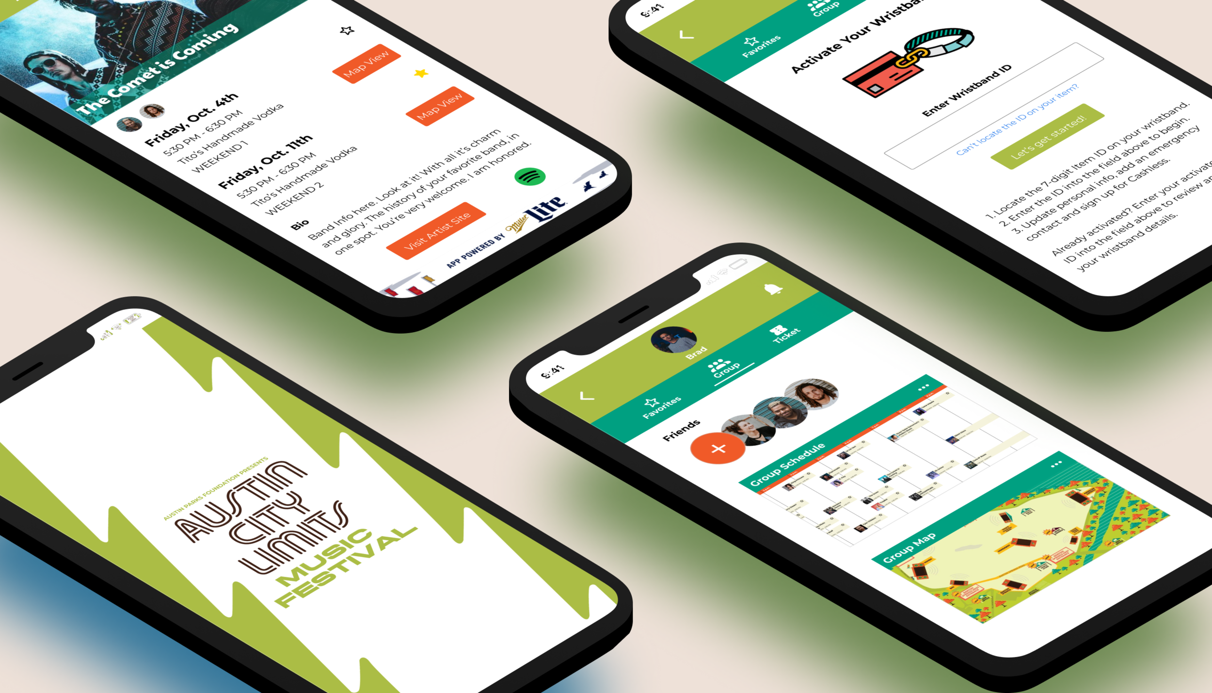
Redesign App Must-haves
Sidebar that's organized by categories with clean, identifiable icons
A homepage that includes major headliners to add excitement
Create drop-pins feature to account for meetup spots
New information architecture & filtering options
Redesign the event schedule to allow for visibility
Build-out the profile page to include favorites, friends, & ticket/wristband information
The ability to sync + share information to provide for dropped data or Wifi

How do we equally account for first-time festival-goers & seasoned veterans?
In the initial sketches and wireframes, we revamped the schedule page to allow users to toggle between weeks 1 + 2 & view the schedule or lineup; Filter options were the final feature added.
Then our profile section was developed to house user favorites, friends, & ticket/wristband information. Finally, we deliberated the method & use of the drop pins for our interactive map feature.
After ideating & sketching, our team collaborated to create a Medium fidelity prototype using Figma to support usability testing & identify any lingering pain points.
Usability Testing
Scenario
You are attending ACL Weekend two with three of his closest friends & you want to create a master itinerary for your crew. How might we?…..
Task 2 - Add friends to share favorited events
Task 3 - Set a drop pin meetup spot to reconnect with the whole party
Top three takeaways:
New users had a hard time distinguishing icon functions & need more microcopy notices.
Our verbiage had to be corrected as not to mislead users to wrong sections of the App.
Users became lost because they had no title indicators of what page they had landed on.

Visibility
Feedback from usability testing allowed us to create cleaner headers with text title bars to show users what page they were on. In the artist bio section, we swapped out the word "Locate" to "View Map."
This exchange made the user's aware that they are being brought to a map of the stage where the artist is expected to perform & not to locate themselves on a map.
Navigation & Toggling
The toggle between weeks 1 & 2 confused many green festival app users. They struggled at attempting the first task, either incorrectly using the filter options or sporadically clicking on the page in hopes of landing on the right choice.


Learnability
From a new user standpoint, this issue made sense. They wouldn't have the intuition or recall as someone with prior experience would have to pull from, they would solely be relying on App learnability.
How do we make it easier for users to absorb this concept? After more ideations & iterations, we added a toggle icon along with title bar text that would correlate with the week change when tapped, which proved fruitful in our last round of testing.
Finishing Touches
Finally, it was time to UI the UX. By using Figma , we created high fidelity mockups to our corresponding sections. Incorporating usability feedback, improved UX writing, & tying in our style guide to match the branding on the website.