

Making aNew: Polestar x Wall Street Journal
Results
80%+ watches, 30+ secs of each video
4% of visitors used car configurator
~1% completed configuration to reserve vehicle
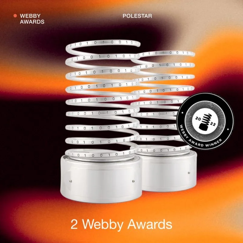
Received 5 design awards & honors

“Very neat and expert look. All carefully designed and crafted. Great example of what amazing things can be done when fantastic ideas and tech meet.”
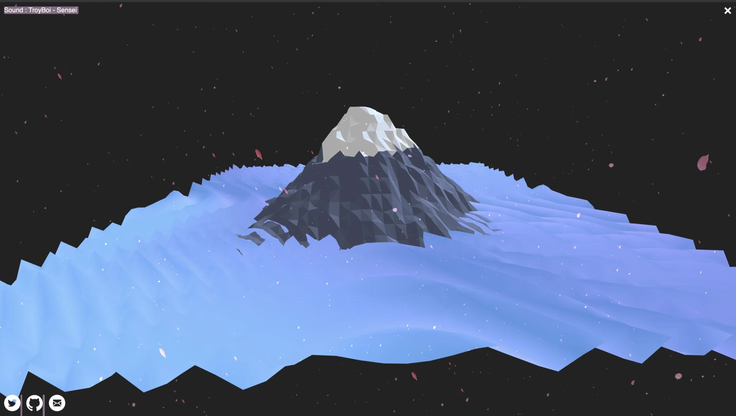
Take a peak underneath the hood, to see how our team at Code d’Azur brought to life this epic collaboration between Oscar Isaac, The Wall Street Journal (WSJ) & Polestar - through Blockchain tracing, Smart cities, performance, material design & technology - to discover the global shift in sustainable mobility that the groundbreaking Electric Vehicle company is spearheading.
Research


Architecture Overview

SEO Strategy
Traffic was directed to the Making aNew site via social media, ads, promotional modules on polestar.com, & Polestar.com/news.

Design
In this section, I’ll break down page elements to show how methodical every design decision was that our team made & how it benefited our users during their exploratory experience.
Tap to enlarge
Landing Page
1. Navigation
It was important to use a navigational element that depicted vertical movement to cue users on how the pages would flow. The usage of vertically stacked dashes is sleek & modern, which is very representative of the Polestar brand.
2. Scroll Button
Descriptive text, along with an animated chevron, informs the user to scroll for more content. Additionally, by clicking the element, this would act as an anchor link, jumping to the next episode within the series.
3. View All + Sound
To declutter the viewport, we chose to use an icon link that signifies the ability to view multiple episodes. Further, we gave clearer indication, with a hover text effect that read “View All”.
Title Card
1. View Episode
By tapping the descriptor text CTA (right facing arrow), this would take user’s from the animated title screens into the Interior Page of the episode, where the main video & more detailed episode information is found.
2. Navigation
On Desktop, it is not as intuitive to scroll up or down as it is on Mobile & Tablet devices. We wanted to add functionality to the Vertical Navigation element here. When hovering over the vertical dashes, the title names appears & you are able to easily scan all titles easily. The user also is able to click on the title links to be brought directly into the selected episode page.
3. Transition
Tap to enlarge
Tap to enlarge
Interior Episode Page
1. Back Link to Title Screens
We placed this text link at the top of the interior page for users to easily return to that specific Title Screen within the series , so they can select another Title of interest. This also supports the narrative arc of storytelling when user’s sift through Title Screens on the page.
2. Share Icon
Ability for users to easily share video out to their preferred social networks, will help drive traffic to the site and help with deep linking initiatives mentioned earlier.
3. Body Copy
On mobile, the infographic peeks out from the bottom of the screen to signify users to scroll down to further view content that lays hidden below the fold. For this to work properly on all devices, we had to deviate text size. Using a 16pt font, on mobile & 30pt font on Tablet + Desktop devices.
4. Infographic
5. Link Outs
We chose to provide a typographic layout, unified with a color block & an arrow, to link out to easily hit our second objective of users checking out the Polesar 2.
6. Seamless Trigger w/ countdown to Next Episode
Similar to how the infographics will peek out from the bottom of the page before you scroll, we have the next in series imagery peeking out from bottom of the page to indicate user’s to scroll. This scroll motion triggers an animation to move users continuously through the series & locks into the new title screen after a brief 3-second countdown ends.
Change of heart? As long as the countdown is active, the user can back out of the next episode trigger & continue to scroll back up within the current interior episode page.
Explore Page
1.CTA to Product Page
After all of the Episode Title screens, the product page was placed at the end of the experience, . Essentially acting as the final screen, prompting users to learn more about Polestar, as well as their newest release of the Polestar 2.
2.Vehicle Image
Even the static image was tactical, by transitioning from animated backgrounds to a static image, this visual indicator was enough to cue to user’s that this page was different from the prior episode title screens, which enticed them to explore.
Tap to enlarge
Final Result
Austin Team Credits
Company: Code d'Azur
Senior Visual Designer: Steven Lao
Visual Designer: Tina Bozsik
UX Writer: Leeza Dennis
UX Designer: Brittany Crocker- Self 👋
Producer: Jason Mitton